by Mr.Mozart, published on TradingView
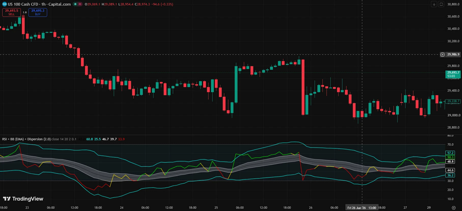
No one can tell in advance whether this is the right entry point or not.
But whether this candle is gaining strength upward or getting pushed down.
Isn't there at least a tool that can tell us that?
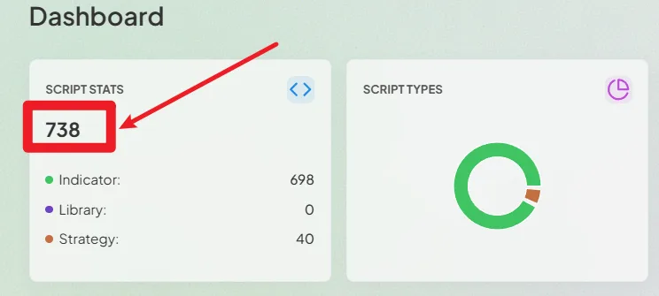
That one question is why we went through 738 indicators, one by one.
This indicator is one of them.
It uses RSI, but not to call overbought or oversold.
Instead, we counted every signal entry across all 10 instruments ourselves.
Let me start with the bottom line.
When entering after the green signal fired, only 34 out of 100 trades ended positive.
That means 2 out of every 3 were losses.
But strangely, when we added everything up, the average return was positive.
Why the overall result can still be positive even when losses outnumber wins.
And whether that actually makes this a good indicator.
And finally, how to actually use it in practice.
This report covers all three.
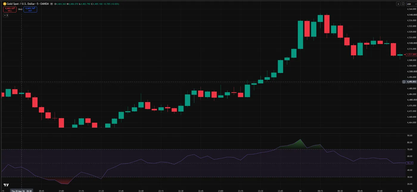
The standard lesson: RSI above 70 is overbought. Below 30, oversold.
But there's a problem.
70 and 30 never move — regardless of what the market does.
In a strong uptrend, price can keep climbing long after RSI clears 70. In a flat market, RSI might never leave the 50s.
The same 70 can be a real signal in one market and completely meaningless in another.
That's why this indicator doesn't use 70 and 30 as its benchmark.
Instead, it applies Bollinger Bands — not to price, but to RSI itself.
Bollinger Bands were built to show the range price normally trades in.
Apply that to RSI, and the band at the bottom of the chart shows the range RSI has been living in recently.
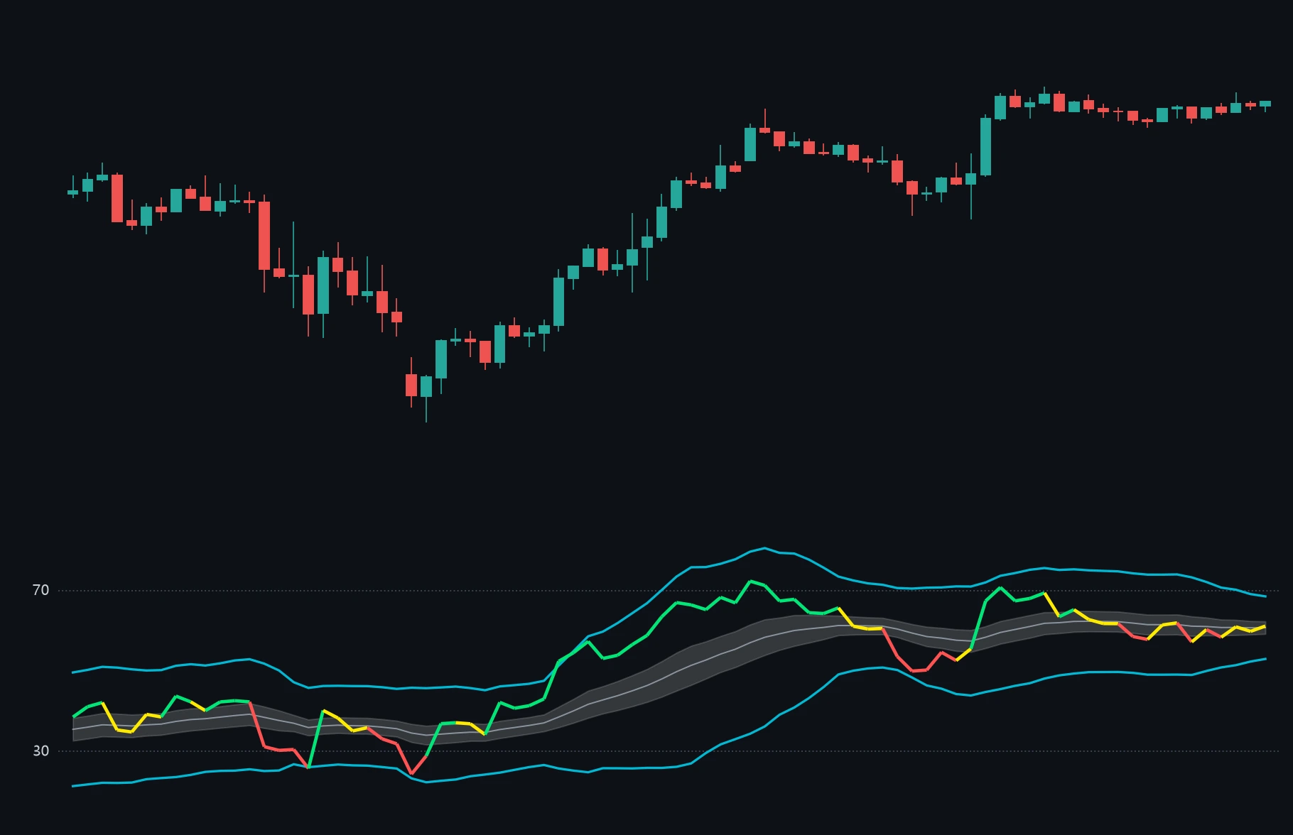
When RSI breaks above that range, it goes green. Below it, red.
Not a fixed number. How much RSI has shifted from its own recent normal — in this market, right now.
So the question this indicator asks isn't
"Did RSI cross 70?"
It asks: "Is the current push stronger than usual?"
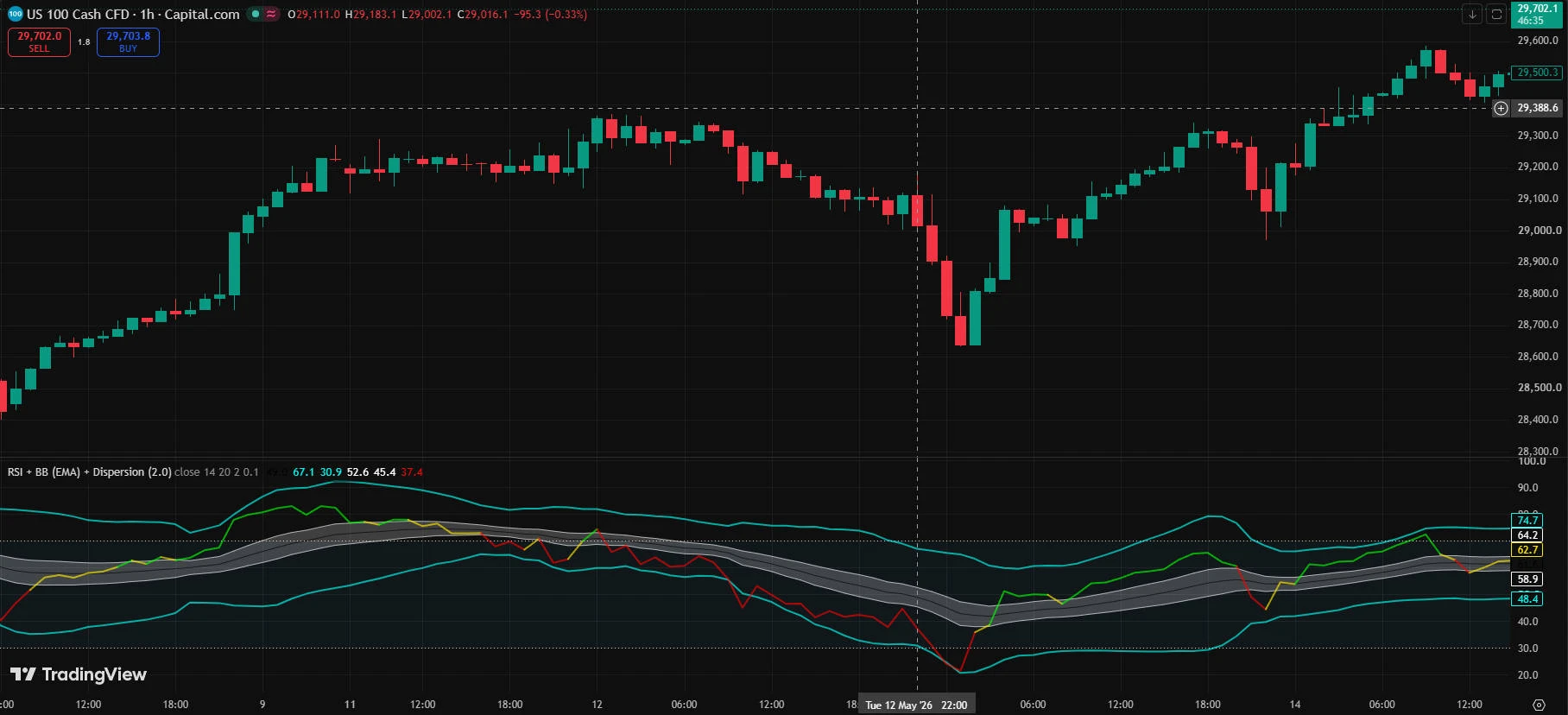
From here on, just remember three terms. They'll keep coming up.
Turns Green
RSI has broken above the gray reference band.
This is where we start tracking results in this article.
Turns Red
The opposite: RSI has dropped below the reference band.
This is where a signal ends.
Dispersion
This is the Dispersion in the indicator's name.
Think of it as an extra buffer zone placed just outside the gray band.
A slight touch of the band won't trigger a color change — RSI has to clear this buffer before a green or red signal fires.
First, let's look at the cases where the signal paid off.
This isn't the biggest mover in the data.
We took all 486 profitable trades after the signal, ranked them by result, and picked the median.
So this is as close as you get to the most ordinary trade — when the indicator moved exactly as intended.
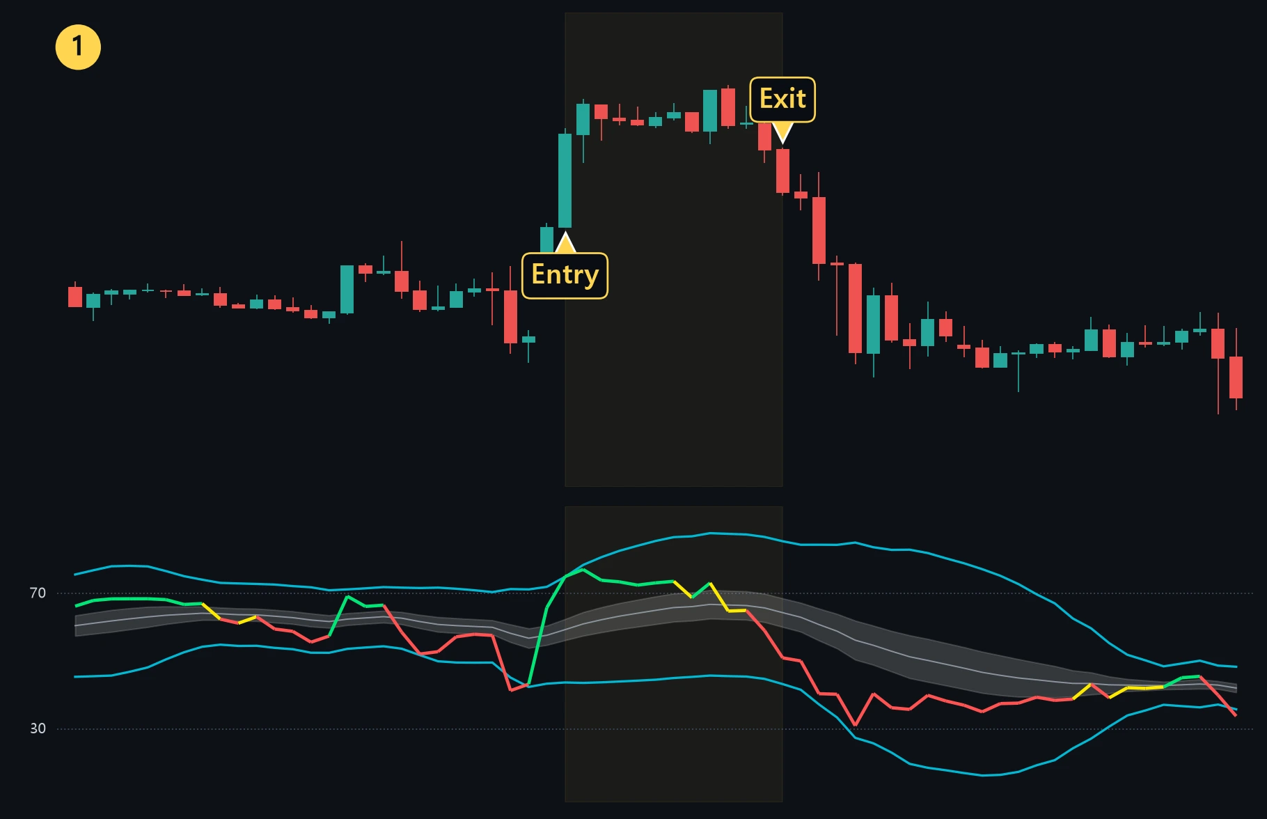
This single trade returned +0.68%. On a $10,000 position, that's about $68. Add leverage, and the number goes anywhere.
But this is one trade. Not an average.
The chart is there to show what the signal actually looks like.
What you really want to know is how often trades like this show up across the whole dataset.
So we put the averages below.
Continue with research analyzed in-house by TVIEW LAB.
